

Exploratory data analysis (EDA) is a common task performed by business analysts to discover patterns, understand relationships, validate assumptions, and identify anomalies in their data. In machine learning (ML), it’s important to first understand the data and its relationships before getting into model building. Traditional ML development cycles can sometimes take months and require advanced data science and ML engineering skills, whereas no-code ML solutions can help companies accelerate the delivery of ML solutions to days or even hours.
Amazon SageMaker Canvas is a no-code ML tool that helps business analysts generate accurate ML predictions without having to write code or without requiring any ML experience. Canvas provides an easy-to-use visual interface to load, cleanse, and transform the datasets, followed by building ML models and generating accurate predictions.
In this post, we walk through how to perform EDA to gain a better understanding of your data before building your ML model, thanks to Canvas’ built-in advanced visualizations. These visualizations help you analyze the relationships between features in your datasets and comprehend your data better. This is done intuitively, with the ability to interact with the data and discover insights that may go unnoticed with ad hoc querying. They can be created quickly through the ‘Data visualizer’ within Canvas prior to building and training ML models.
Solution overview
These visualizations add to the range of capabilities for data preparation and exploration already offered by Canvas, including the ability to correct missing values and replace outliers; filter, join, and modify datasets; and extract specific time values from timestamps. To learn more about how Canvas can help you cleanse, transform, and prepare your dataset, check out Prepare data with advanced transformations.
For our use case, we look at why customers churn in any business and illustrate how EDA can help from a viewpoint of an analyst. The dataset we use in this post is a synthetic dataset from a telecommunications mobile phone carrier for customer churn prediction that you can download (churn.csv), or you bring your own dataset to experiment with. For instructions on importing your own dataset, refer to Importing data in Amazon SageMaker Canvas.
Prerequisites
Follow the instructions in Prerequisites for setting up Amazon SageMaker Canvas before you proceed further.
Import your dataset to Canvas
To import the sample dataset to Canvas, complete the following steps:
Log in to Canvas as a business user.First, we upload the dataset mentioned previously from our local computer to Canvas. If you want to use other sources, such as Amazon Redshift, refer to Connect to an external data source.
Choose Import.
Choose Upload, then choose Select files from your computer.
Select your dataset (churn.csv) and choose Import data.
Select the dataset and choose Create model.
For Model name, enter a name (for this post, we have given the name Churn prediction).
Choose Create.
As soon as you select your dataset, you’re presented with an overview that outlines the data types, missing values, mismatched values, unique values, and the mean or mode values of the respective columns.
From an EDA perspective, you can observe there are no missing or mismatched values in the dataset. As a business analyst, you may want to get an initial insight into the model build even before starting the data exploration to identify how the model will perform and what factors are contributing to the model’s performance. Canvas gives you the ability to get insights from your data before you build a model by first previewing the model.
Before you do any data exploration, choose Preview model.
Select the column to predict (churn).Canvas automatically detects this is two-category prediction.
Choose Preview model. SageMaker Canvas uses a subset of your data to build a model quickly to check if your data is ready to generate an accurate prediction. Using this sample model, you can understand the current model accuracy and the relative impact of each column on predictions.
The following screenshot shows our preview.
The model preview indicates that the model predicts the correct target (churn?) 95.6% of the time. You can also see the initial column impact (influence each column has on the target column). Let’s do some data exploration, visualization, and transformation, and then proceed to build a model.
Data exploration
Canvas already provides some common basic visualizations, such as data distribution in a grid view on the Build tab. These are great for getting a high-level overview of the data, understanding how the data is distributed, and getting a summary overview of the dataset.
As a business analyst, you may need to get high-level insights on how the data is distributed as well as how the distribution reflects against the target column (churn) to easily understand the data relationship before building the model. You can now choose Grid view to get an overview of the data distribution.
The following screenshot shows the overview of the distribution of the dataset.
We can make the following observations:
Phone takes on too many unique values to be of any practical use. We know phone is a customer ID and don’t want to build a model that might consider specific customers, but rather learn in a more general sense what could lead to churn. You can remove this variable.
Most of the numeric features are nicely distributed, following a Gaussian bell curve. In ML, you want the data to be distributed normally because any variable that exhibits normal distribution is able to be forecasted with higher accuracy.
Let’s go deeper and check out the advanced visualizations available in Canvas.
Data visualization
As business analysts, you want to see if there are relationships between data elements, and how they’re related to churn. With Canvas, you can explore and visualize your data, which helps you gain advanced insights into your data before building your ML models. You can visualize using scatter plots, bar charts, and box plots, which can help you understand your data and discover the relationships between features that could affect the model accuracy.
To start creating your visualizations, complete the following steps:
On the Build tab of the Canvas app, choose Data visualizer.
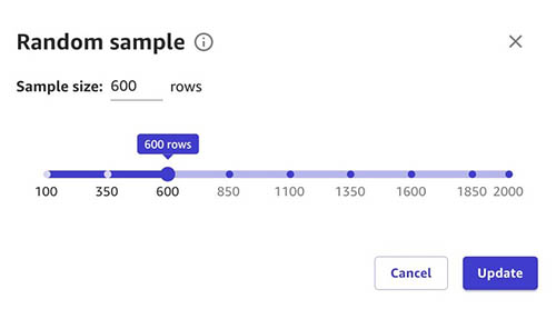
A key accelerator of visualization in Canvas is the Data visualizer. Let’s change the sample size to get a better perspective.
Choose number of rows next to Visualization sample.
Use the slider to select your desired sample size.
Choose Update to confirm the change to your sample size.
You may want to change the sample size based on your dataset. In some cases, you may have a few hundred to a few thousand rows where you can select the entire dataset. In some cases, you may have several thousand rows, in which case you may select a few hundred or a few thousand rows based on your use case.
A scatter plot shows the relationship between two quantitative variables measured for the same individuals. In our case, it’s important to understand the relationship between values to check for correlation.
Because we have Calls, Mins, and Charge, we will plot the correlation between them for Day, Evening, and Night.
First, let’s create a scatter plot between Day Charge vs. Day Mins.
We can observe that as Day Mins increases, Day Charge also increases.
The same applies for evening calls.
Night calls also have the same pattern.
Because mins and charge seem to increase linearly, you can observe that they have a high correlation with one another. Including these feature pairs in some ML algorithms can take additional storage and reduce the speed of training, and having similar information in more than one column might lead to the model overemphasizing the impacts and lead to undesired bias in the model. Let’s remove one feature from each of the highly correlated pairs: Day Charge from the pair with Day Mins, Night Charge from the pair with Night Mins, and Intl Charge from the pair with Intl Mins.
Data balance and variation
A bar chart is a plot between a categorical variable on the x-axis and numerical variable on y-axis to explore the relationship between both variables. Let’s create a bar chart to see the how the calls are distributed across our target column Churn for True and False. Choose Bar chart and drag and drop day calls and churn to the y-axis and x-axis, respectively.
Now, let’s create same bar chart for evening calls vs churn.
Next, let’s create a bar chart for night calls vs. churn.
It looks like there is a difference in behavior between customers who have churned and those that didn’t.
Box plots are useful because they show differences in behavior of data by class (churn or not). Because we’re going to predict churn (target column), let’s create a box plot of some features against our target column to infer descriptive statistics on the dataset such as mean, max, min, median, and outliers.
Choose Box plot and drag and drop Day mins and Churn to the y-axis and x-axis, respectively.
You can also try the same approach to other columns against our target column (churn).
Let’s now create a box plot of day mins against customer service calls to understand how the customer service calls spans across day mins value. You can see that customer service calls don’t have a dependency or correlation on the day mins value.
From our observations, we can determine that the dataset is fairly balanced. We want the data to be evenly distributed across true and false values so that the model isn’t biased towards one value.
Transformations
Based on our observations, we drop Phone column because it is just an account number and Day Charge, Eve Charge, Night Charge columns because they contain overlapping information such as the mins columns, but we can run a preview again to confirm.
After the data analysis and transformation, let’s preview the model again.
You can observe that the model estimated accuracy changed from 95.6% to 93.6% (this could vary), however the column impact (feature importance) for specific columns has changed considerably, which improves the speed of training as well as the columns’ influence on the prediction as we move to next steps of model building. Our dataset doesn’t require additional transformation, but if you needed to you could take advantage of ML data transforms to clean, transform, and prepare your data for model building.
Build the model
You can now proceed to build a model and analyze results. For more information, refer to Predict customer churn with no-code machine learning using Amazon SageMaker Canvas.
Clean up
To avoid incurring future session charges, log out of Canvas.
Conclusion
In this post, we showed how you can use Canvas visualization capabilities for EDA to better understand your data before model building, create accurate ML models, and generate predictions using a no-code, visual, point-and-click interface.
For more information about creating ML models with a no-code solution, see Announcing Amazon SageMaker Canvas – a Visual, No Code Machine Learning Capability for Business Analysts.
To learn more about visualization in Canvas, refer to Explore your data using visualization techniques.
For more information about model training and inference in Canvas, refer to Predict customer churn with no-code machine learning using Amazon SageMaker Canvas.
To learn more about using Canvas, see Build, Share, Deploy: how business analysts and data scientists achieve faster time-to-market using no-code ML and Amazon SageMaker Canvas.
About the Authors
Rajakumar Sampathkumar is a Principal Technical Account Manager at AWS, providing customers guidance on business-technology alignment and supporting the reinvention of their cloud operation models and processes. He is passionate about cloud and machine learning. Raj is also a machine learning specialist and works with AWS customers to design, deploy, and manage their AWS workloads and architectures.
Rahul Nabera is a Data Analytics Consultant in AWS Professional Services. His current work focuses on enabling customers build their data and machine learning workloads on AWS. In his spare time, he enjoys playing cricket and volleyball.
Raviteja Yelamanchili is an Enterprise Solutions Architect with Amazon Web Services based in New York. He works with large financial services enterprise customers to design and deploy highly secure, scalable, reliable, and cost-effective applications on the cloud. He brings over 11+ years of risk management, technology consulting, data analytics, and machine learning experience. When he is not helping customers, he enjoys traveling and playing PS5.
Read MoreAWS Machine Learning Blog