

Time series data is widely present in our lives. Stock prices, house prices, weather information, and sales data captured over time are just a few examples. As businesses increasingly look for new ways to gain meaningful insights from time-series data, the ability to visualize data and apply desired transformations are fundamental steps. However, time-series data possesses unique characteristics and nuances compared to other kinds of tabular data, and require special considerations. For example, standard tabular or cross-sectional data is collected at a specific point in time. In contrast, time series data is captured repeatedly over time, with each successive data point dependent on its past values.
Because most time series analyses rely on the information gathered across a contiguous set of observations, missing data and inherent sparseness can reduce the accuracy of forecasts and introduce bias. Additionally, most time series analysis approaches rely on equal spacing between data points, in other words, periodicity. Therefore, the ability to fix data spacing irregularities is a critical prerequisite. Finally, time series analysis often requires the creation of additional features that can help explain the inherent relationship between input data and future predictions. All these factors differentiate time series projects from traditional machine learning (ML) scenarios and demand a distinct approach to its analysis.
This post walks through how to use Amazon SageMaker Data Wrangler to apply time series transformations and prepare your dataset for time series use cases.
Use cases for Data Wrangler
Data Wrangler provides a no-code/low-code solution to time series analysis with features to clean, transform, and prepare data faster. It also enables data scientists to prepare time series data in adherence to their forecasting model’s input format requirements. The following are a few ways you can use these capabilities:
Descriptive analysis– Usually, step one of any data science project is understanding the data. When we plot time series data, we get a high-level overview of its patterns, such as trend, seasonality, cycles, and random variations. It helps us decide the correct forecasting methodology for accurately representing these patterns. Plotting can also help identify outliers, preventing unrealistic and inaccurate forecasts. Data Wrangler comes with a seasonality-trend decomposition visualization for representing components of a time series, and an outlier detection visualization to identify outliers.
Explanatory analysis– For multi-variate time series, the ability to explore, identify, and model the relationship between two or more time series is essential for obtaining meaningful forecasts. The Group by transform in Data Wrangler creates multiple time series by grouping data for specified cells. Additionally, Data Wrangler time series transforms, where applicable, allow specification of additional ID columns to group on, enabling complex time series analysis.
Data preparation and feature engineering– Time series data is rarely in the format expected by time series models. It often requires data preparation to convert raw data into time series-specific features. You may want to validate that time series data is regularly or equally spaced prior to analysis. For forecasting use cases, you may also want to incorporate additional time series characteristics, such as autocorrelation and statistical properties. With Data Wrangler, you can quickly create time series features such as lag columns for multiple lag periods, resample data to multiple time granularities, and automatically extract statistical properties of a time series, to name a few capabilities.
Solution overview
This post elaborates on how data scientists and analysts can use Data Wrangler to visualize and prepare time series data. We use the bitcoin cryptocurrency dataset from cryptodatadownload with bitcoin trading details to showcase these capabilities. We clean, validate, and transform the raw dataset with time series features and also generate bitcoin volume price forecasts using the transformed dataset as input.
The sample of bitcoin trading data is from January 1 – November 19, 2021, with 464,116 data points. The dataset attributes include a timestamp of the price record, the opening or first price at which the coin was exchanged for a particular day, the highest price at which the coin was exchanged on the day, the last price at which the coin was exchanged on the day, the volume exchanged in the cryptocurrency value on the day in BTC, and corresponding USD currency.
Prerequisites
Download the Bitstamp_BTCUSD_2021_minute.csv file from cryptodatadownload and upload it to Amazon Simple Storage Service (Amazon S3).
Import bitcoin dataset in Data Wrangler
To start the ingestion process to Data Wrangler, complete the following steps:
On the SageMaker Studio console, on the File menu, choose New, then choose Data Wrangler Flow.
Rename the flow as desired.
For Import data, choose Amazon S3.
Upload the Bitstamp_BTCUSD_2021_minute.csv file from your S3 bucket.
You can now preview your data set.
In the Details pane, choose Advanced configuration and deselect Enable sampling.
This is a relatively small data set, so we don’t need sampling.
Choose Import.
You have successfully created the flow diagram and are ready to add transformation steps.
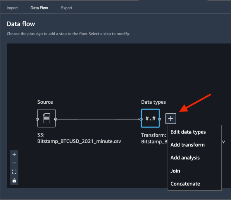
Add transformations
To add data transformations, choose the plus sign next to Data types and choose Edit data types.
Ensure that Data Wrangler automatically inferred the correct data types for the data columns.
In our case, the inferred data types are correct. However, suppose one data type was incorrect. You can easily modify them through the UI, as shown in the following screenshot.
Let’s kick off the analysis and start adding transformations.
Data cleaning
We first perform several data cleaning transformations.
Drop column
Let’s start by dropping the unix column, because we use the date column as the index.
Choose Back to data flow.
Choose the plus sign next to Data types and choose Add transform.
Choose + Add step in the TRANSFORMS pane.
Choose Manage columns.
For Transform, choose Drop column.
For Column to drop, choose unix.
Choose Preview.
Choose Add to save the step.
Handle missing
Missing data is a well-known problem in real-world datasets. Therefore, it’s a best practice to verify the presence of any missing or null values and handle them appropriately. Our dataset doesn’t contain missing values. But if there were, we would use the Handle missing time series transform to fix them. Commonly used strategies for handling missing data include dropping rows with missing values or filling the missing values with reasonable estimates. Because time series data relies on a sequence of data points across time, filling missing values is the preferred approach. The process of filling missing values is referred to as imputation. The Handle missing time series transform allows you to choose from multiple imputation strategies.
Choose + Add step in the TRANSFORMS pane.
Choose the Time Series transform.
For Transform, Choose Handle missing.
For Time series input type, choose Along column.
For Method for imputing values, choose Forward fill.
The Forward fill method replaces the missing values with the non-missing values preceding the missing values.
Backward fill, Constant Value, Most common value and Interpolate are other imputation strategies available in Data Wrangler. Interpolation techniques rely on neighboring values for filling missing values. Time series data often exhibits correlation between neighboring values, making interpolation an effective filling strategy. For additional details on the functions you can use for applying interpolation, refer to pandas.DataFrame.interpolate.
Validate timestamp
In time series analysis, the timestamp column acts as the index column, around which the analysis revolves. Therefore, it’s essential to make sure the timestamp column doesn’t contain invalid or incorrectly formatted time stamp values. Because we’re using the date column as the timestamp column and index, let’s confirm its values are correctly formatted.
Choose + Add step in the TRANSFORMS pane.
Choose the Time Series transform.
For Transform, choose Validate timestamps.
The Validate timestamps transform allows you to check that the timestamp column in your dataset doesn’t have values with an incorrect timestamp or missing values.
For Timestamp Column, choose date.
For Policy dropdown, choose Indicate.
The Indicate policy option creates a Boolean column indicating if the value in the timestamp column is a valid date/time format. Other options for Policy include:
Error – Throws an error if the timestamp column is missing or invalid
Drop – Drops the row if the timestamp column is missing or invalid
Choose Preview.
A new Boolean column named date_is_valid was created, with true values indicating correct format and non-null entries. Our dataset doesn’t contain invalid timestamp values in the date column. But if it did, you could use the new Boolean column to identify and fix those values.
Choose Add to save this step.
Time series visualization
After we clean and validate the dataset, we can better visualize the data to understand its different component.
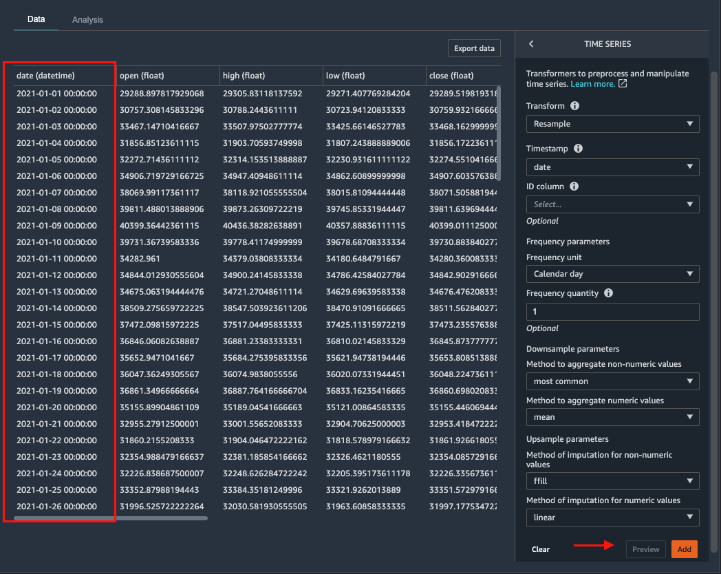
Resample
Because we’re interested in daily predictions, let’s transform the frequency of data to daily.
The Resample transformation changes the frequency of the time series observations to a specified granularity, and comes with both upsampling and downsampling options. Applying upsampling increases the frequency of the observations (for example from daily to hourly), whereas downsampling decreases the frequency of the observations (for example from hourly to daily).
Because our dataset is at minute granularity, let’s use the downsampling option.
Choose + Add step.
Choose the Time Series transform.
For Transform, choose Resample.
For Timestamp, choose date.
For Frequency unit, choose Calendar day.
For Frequency quantity, enter 1.
For Method to aggregate numeric values, choose mean.
Choose Preview.
The frequency of our dataset has changed from per minute to daily.
Choose Add to save this step.
Seasonal-Trend decomposition
After resampling, we can visualize the transformed series and its associated STL (Seasonal and Trend decomposition using LOESS) components using the Seasonal-Trend-decomposition visualization. This breaks down original time series into distinct trend, seasonality and residual components, giving us a good understanding of how each pattern behaves. We can also use the information when modelling forecasting problems.
Data Wrangler uses LOESS, a robust and versatile statistical method for modelling trend and seasonal components. It’s underlying implementation uses polynomial regression for estimating nonlinear relationships present in the time series components (seasonality, trend, and residual).
Choose Back to data flow.
Choose the plus sign next to the Steps on Data Flow.
Choose Add analysis.
In the Create analysis pane, for Analysis type, choose Time Series.
For Visualization, choose Seasonal-Trend decomposition.
For Analysis Name, enter a name.
For Timestamp column, choose date.
For Value column, choose Volume USD.
Choose Preview.
The analysis allows us to visualize the input time series and decomposed seasonality, trend, and residual.
Choose Save to save the analysis.
With the seasonal-trend decomposition visualization, we can generate four patterns, as shown in the preceding screenshot:
Original – The original time series re-sampled to daily granularity.
Trend – The polynomial trend with an overall negative trend pattern for the year 2021, indicating a decrease in Volume USD value.
Season – The multiplicative seasonality represented by the varying oscillation patterns. We see a decrease in seasonal variation, characterized by decreasing amplitude of oscillations.
Residual – The remaining residual or random noise. The residual series is the resulting series after trend and seasonal components have been removed. Looking closely, we observe spikes between January and March, and between April and June, suggesting room for modelling such particular events using historical data.
These visualizations provide valuable leads to data scientists and analysts into existing patterns and can help you choose a modelling strategy. However, it’s always a good practice to validate the output of STL decomposition with the information gathered through descriptive analysis and domain expertise.
To summarize, we observe a downward trend consistent with original series visualization, which increases our confidence in incorporating the information conveyed by trend visualization into downstream decision-making. In contrast, the seasonality visualization helps inform the presence of seasonality and the need for its removal by applying techniques such as differencing, it doesn’t provide the desired level of detailed insight into various seasonal patterns present, thereby requiring deeper analysis.
Feature engineering
After we understand the patterns present in our dataset, we can start to engineer new features aimed to increase the accuracy of the forecasting models.
Featurize datetime
Let’s start the feature engineering process with more straightforward date/time features. Date/time features are created from the timestamp column and provide an optimal avenue for data scientists to start the feature engineering process. We begin with the Featurize datetime time series transformation to add the month, day of the month, day of the year, week of the year, and quarter features to our dataset. Because we’re providing the date/time components as separate features, we enable ML algorithms to detect signals and patterns for improving prediction accuracy.
Choose + Add step.
Choose the Time Series transform.
For Transform, choose Featurize datetime.
For Input Column, choose date.
For Output Column, enter date (this step is optional).
For Output mode, choose Ordinal.
For Output format, choose Columns.
For date/time features to extract, select Month, Day, Week of year, Day of year, and Quarter.
Choose Preview.
The dataset now contains new columns named date_month, date_day, date_week_of_year, date_day_of_year, and date_quarter. The information retrieved from these new features could help data scientists derive additional insights from the data and into the relationship between input features and output features.
Choose Add to save this step.
Encode categorical
Date/time features aren’t limited to integer values. You may also choose to consider certain extracted date/time features as categorical variables and represent them as one-hot encoded features, with each column containing binary values. The newly created date_quarter column contains values between 0-3, and can be one-hot encoded using four binary columns. Let’s create four new binary features, each representing the corresponding quarter of the year.
Choose + Add step.
Choose the Encode categorical transform.
For Transform, choose One-hot encode.
For Input column, choose date_quarter.
For Output style, choose Columns.
Choose Preview.
Choose Add to add the step.
Lag feature
Next, let’s create lag features for the target column Volume USD. Lag features in time series analysis are values at prior timestamps that are considered helpful in inferring future values. They also help identify autocorrelation (also known as serial correlation) patterns in the residual series by quantifying the relationship of the observation with observations at previous time steps. Autocorrelation is similar to regular correlation but between the values in a series and its past values. It forms the basis for the autoregressive forecasting models in the ARIMA series.
With the Data Wrangler Lag feature transform, you can easily create lag features n periods apart. Additionally, we often want to create multiple lag features at different lags and let the model decide the most meaningful features. For such a scenario, the Lag features transform helps create multiple lag columns over a specified window size.
Choose Back to data flow.
Choose the plus sign next to the Steps on Data Flow.
Choose + Add step.
Choose Time Series transform.
For Transform, choose Lag features.
For Generate lag features for this column, choose Volume USD.
For Timestamp Column, choose date.
For Lag, enter 7.
Because we’re interested in observing up to the previous seven lag values, let’s select Include the entire lag window.
To create a new column for each lag value, select Flatten the output.
Choose Preview.
Seven new columns are added, suffixed with the lag_number keyword for the target column Volume USD.
Choose Add to save the step.
Rolling window features
We can also calculate meaningful statistical summaries across a range of values and include them as input features. Let’s extract common statistical time series features.
Data Wrangler implements automatic time series feature extraction capabilities using the open source tsfresh package. With the time series feature extraction transforms, you can automate the feature extraction process. This eliminates the time and effort otherwise spent manually implementing signal processing libraries. For this post, we extract features using the Rolling window features transform. This method computes statistical properties across a set of observations defined by the window size.
Choose + Add step.
Choose the Time Series transform.
For Transform, choose Rolling window features.
For Generate rolling window features for this column, choose Volume USD.
For Timestamp Column, choose date.
For Window size, enter 7.
Specifying a window size of 7 computes features by combining the value at the current timestamp and values for the previous seven timestamps.
Select Flatten to create a new column for each computed feature.
Choose your strategy as Minimal subset.
This strategy extracts eight features that are useful in downstream analyses. Other strategies include Efficient Subset, Custom subset, and All features. For full list of features available for extraction, refer to Overview on extracted features.
Choose Preview.
We can see eight new columns with specified window size of 7 in their name, appended to our dataset.
Choose Add to save the step.
Export the dataset
We have transformed the time series dataset and are ready to use the transformed dataset as input for a forecasting algorithm. The last step is to export the transformed dataset to Amazon S3. In Data Wrangler, you can choose Export step to automatically generate a Jupyter notebook with Amazon SageMaker Processing code for processing and exporting the transformed dataset to a S3 bucket. However, because our dataset contains just over 300 records, let’s take advantage of the Export data option in the Add Transform view to export the transformed dataset directly to Amazon S3 from Data Wrangler.
Choose Export data.
For S3 location, choose Browser and choose your S3 bucket.
Choose Export data.
Now that we have successfully transformed the bitcoin dataset, we can use Amazon Forecast to generate bitcoin predictions.
Clean up
If you’re done with this use case, clean up the resources you created to avoid incurring additional charges. For Data Wrangler you can shutdown the underlying instance when finished. Refer to Shut Down Data Wrangler documentation for details. Alternatively, you can continue to Part 2 of this series to use this dataset for forecasting.
Summary
This post demonstrated how to utilize Data Wrangler to simplify and accelerate time series analysis using its built-in time series capabilities. We explored how data scientists can easily and interactively clean, format, validate, and transform time series data into the desired format, for meaningful analysis. We also explored how you can enrich your time series analysis by adding a comprehensive set of statistical features using Data Wrangler. To learn more about time series transformations in Data Wrangler, see Transform Data.
About the Author
Roop Bains is a Solutions Architect at AWS focusing on AI/ML. He is passionate about helping customers innovate and achieve their business objectives using Artificial Intelligence and Machine Learning. In his spare time, Roop enjoys reading and hiking.
Nikita Ivkin is an Applied Scientist, Amazon SageMaker Data Wrangler.
Read MoreAWS Machine Learning Blog