

Amazon SageMaker Data Wrangler is a purpose-built data aggregation and preparation tool for machine learning (ML). It allows you to use a visual interface to access data and perform exploratory data analysis (EDA) and feature engineering. The EDA feature comes with built-in data analysis capabilities for charts (such as scatter plot or histogram) and time-saving model analysis capabilities such as feature importance, target leakage, and model explainability. The feature engineering capability has over 300 built-in transforms and can perform custom transformations using either Python, PySpark, or Spark SQL runtime.
For custom visualizations and transforms, Data Wrangler now provides example code snippets for common types of visualizations and transforms. In this post, we demonstrate how to use these code snippets to quickstart your EDA in Data Wrangler.
Solution overview
At the time of this writing, you can import datasets into Data Wrangler from Amazon Simple Storage Service (Amazon S3), Amazon Athena, Amazon Redshift, Databricks, and Snowflake. For this post, we use Amazon S3 to store the 2014 Amazon reviews dataset. The following is a sample of the dataset:
In this post, we perform EDA using three columns—asin, reviewTime, and overall—which map to the product ID, review time date, and the overall review score, respectively. We use this data to visualize dynamics for the number of reviews across months and years.
Using example Code Snippet for EDA in Data Wrangler
To start performing EDA in Data Wrangler, complete the following steps:
Download the Digital Music reviews dataset JSON and upload it to Amazon S3.
We use this as the raw dataset for the EDA.
Open Amazon SageMaker Studio and create a new Data Wrangler flow and import the dataset from Amazon S3.
This dataset has nine columns, but we only use three: asin, reviewTime, and overall. We need to drop the other six columns.
Create a custom transform and choose Python (PySpark).
Expand Search example snippets and choose Drop all columns except several.
Enter the provided snippet into your custom transform and follow the directions to modify the code.
Now that we have all the columns we need, let’s filter the data down to only keep reviews between 2000–2020.
Use the Filter timestamp outside range snippet to drop the data before year 2000 and after 2020:
Next, we extract the year and month from the reviewTime column.
Use the Featurize date/time transform.
For Extract columns, choose year and month.
Next, we want to aggregate the number of reviews by year and month that we created in the previous step.
Use the Compute statistics in groups snippet:
Rename the aggregation of the previous step from count(overall) to reviews_num by choosing Manage Columns and the Rename column transform.
Finally, we want to create a heatmap to visualize the distribution of reviews by year and by month.
On the analysis tab, choose Custom visualization.
Expand Search for snippet and choose Heatmap on the drop-down menu.
Enter the provided snippet into your custom visualization:
We get the following visualization.
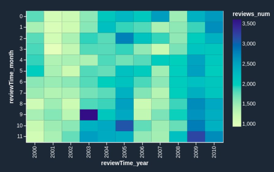
If you want to enhance the heatmap further, you can slice the data to only show reviews prior to 2011. These are hard to identify in the heatmap we just created due to large volumes of reviews since 2012.
Add one line of code to your custom visualization:
We get the following heatmap.
Now the heatmap reflects the reviews prior to 2011 more visibly: we can observe the seasonal effects (the end of the year brings more purchases and therefore more reviews) and can identify anomalous months, such as October 2003 and March 2005. It’s worth investigating further to determine the cause of those anomalies.
Conclusion
Data Wrangler is a purpose-built data aggregation and preparation tool for ML. In this post, we demonstrated how to perform EDA and transform your data quickly using code snippets provided by Data Wrangler. You just need to find a snippet, enter the code, and adjust the parameters to match your dataset. You can continue to iterate on your script to create more complex visualizations and transforms.
To learn more about Data Wrangler, refer to Create and Use a Data Wrangler Flow.
About the Authors
Nikita Ivkin is an Applied Scientist, Amazon SageMaker Data Wrangler.
Haider Naqvi is a Solutions Architect at AWS. He has extensive software development and enterprise architecture experience. He focuses on enabling customers to achieve business outcomes with AWS. He is based out of New York.
Harish Rajagopalan is a Senior Solutions Architect at Amazon Web Services. Harish works with enterprise customers and helps them with their cloud journey.
James Wu is a Senior Customer Solutions Manager at AWS, based in Dallas, TX. He works with customers to accelerate their cloud journey and fast-track their business value realization. In addition to that, James is also passionate about developing and scaling large AI/ ML solutions across various domains. Prior to joining AWS, he led a multi-discipline innovation technology team with ML engineers and software developers for a top global firm in the market and advertising industry.
Read MoreAWS Machine Learning Blog